We have 2 peacocks in the story. This one is the one with the beautiful and colorful tail feathers that most of us a familiar with.
He is not the villan of the short, as we do not have evil in this short. He is mainly there to show how to make the turkey look good. From a design point of view, he is going to be the visual strength of our animation short. We felt confident that even though his character is not well developed, his visual presence will help us fill that gap. So the instructions for Luis were to spend time to make him look good. And again he did, with a few back and forth dialogs through email and chat.

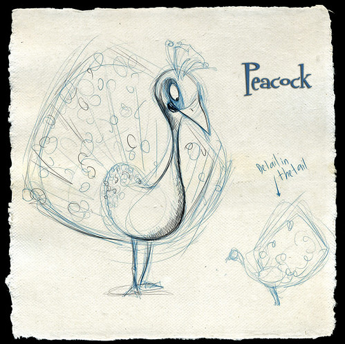
First Draft of the Peacock Design
We loved the eyes and the design in general. We knew the beak was a little too big that needed some more work. So he came up with this version.

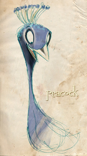
Close up of Peacock
Here is a close up look of the peacock that we wish to use as part of our character development. As you will notice the size of the beak has been reduced and the lips missing from the original concept. The lines are far more defined and sharper than the original concept. They eyes remain the same, and the number of feathers on the head are increased in number.

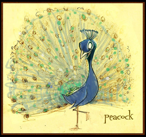
Another draft of the peacock with smaller beak and color.
Symmetry is the cliche standard of beauty in our world. That is what we also decided to use on our peacock. Our thoughts were not to have teeth for the peacock, make him bigger than the turkey in height and length, have those ‘0’ shaped eyes to make him proud. We have been able to capture all of them in the design, while making him look good. Another thing was the ‘eye-brows’, which seems missing in this design, was something we had initially wished to have as it helps us with emotions of the character.
Leave a Reply